http://www.portlandmercury.com/BlogtownPDX/archives/2012/10/25/everybody-chill-out-the-world-isnt-only-douchebags
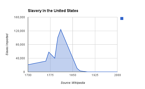
This graph shows the number of imported slaves in the United States at different times throughout the height of slavery. The actual number of slaves in the United States altogether is different that what the graph says. This is because the graph shows the number of slaves that we brought into the country not counting the slaves that were already in America and the children tat they may of had. This graph is important to this website because it shows the decline of the slaves population in America as well. The graph shows the drop from right about 1800 at the height of the slave import, to about 1900 when no slaves were being brought into the country because it was a felony.
